Thursday 26 May 2011

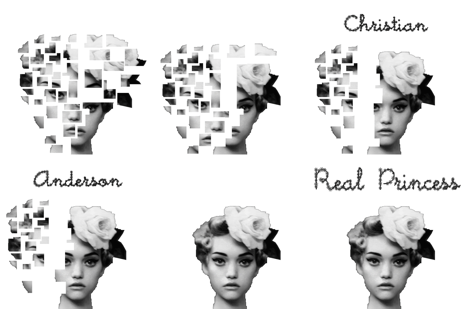
Moving Story Board For 'Real Princess' By Hans Christian Anderson

I made a gif. on photoshop to show what all the images from my story board will look like when they are put together.
It needs to be edited properly, but it gives viewers the main idea of what it will look like. This was just made for fun :)

Story Board For 'Real Princess' By Hans Christian Anderson

For my storyboard, I chose the story 'Real Princess' by Hans Christian Anderson. Each image represents the part of the story where the prince searches for his 'real princess'. In the end, he finds the right princess, which is when the face has been completely pieced together.
In the story, the princess is also very delicate and fragile (which is how they knew she was a princess). The shattered face being put together represents her fragility, and how "none but a real Princess could have had such a delicate sense of feeling".
This is my storyboard:

Image 1

Image 2

Image 3

Image 4

Image 5

Image 6

Image 7

Image 8

Wednesday 25 May 2011

Peer Review Exercise

I chose to review Bianca's Visual Design Blog.

Bianca's Blog is very neatly set out and has very well edited and put together images for her assignments. Throughout her whole blog, there is a consistency of simple yet effective designs. When looking at her CD design and her Advertisement with a Social Conscious, I can tell that she has gone with a very simple design, however they both strongly convey the message she wants to get across to the viewers. She stuck with similar color schemes as a lot of dark colors were used throughout her assignments. I did notice that she always changed the font of every assignment, which kept it fresh and interesting at the same time.
I did notice a sufficient difference between formal and informal design, as in some assignments, all elements were well balanced, while in others there were differences and not a lot of similarities.

If Bianca were to make any improvements, I would say that she should look up a few easy tutorials for her to try out so that she will have a bit more experience with photoshop. This will help her push the boundaries a little with her designs instead of playing it safe and going with simple designs. Maybe even a slight change in color scheme to change the appearance and to show a wider range of designs would be something she could change in order to improve her blog.

Overall, I think her main strengths were that all her assignments were eye-catching, and that’s what any design should be, especially for advertisements. One weakness would be her photoshop techniques which you can see in her bottle advertisement assignment. If she worked on a few more photoshop techniques, I think her advertisement would look a lot better. Again, she has the opportunity to look up easy photoshop tutorials and this will help out with her techniques. I don’t think she has many threats as her work is still easy to look at and to understand the message she is trying to get across to the viewers.
Overall, I really enjoyed scrolling through her blog and I think she did a really good job with her assignments.
.

Sunday 22 May 2011

Love heart made using Illustrator

I'm not sure if this is what the final image should look like, but I made a love heart with illustrator and I used different shapes (lines, circles, squares) and stuck them together to create the shape of a love heart.
This is my final image:

Advertisement

I found this assignment quite difficult to follow, however I did get the main idea of how to create an eye-catching advertisement using photoshop. Its not as extravagant as the image given to us, but I personally think Less is More :)
Here is my final image of my advertisement:

Design Brief for ‘We Come in Peace’ logo

Project Type
Logo Design

Task Outline
Create a logo design

Task Description
We are looking to design a new logo that will be “blasted into outer space to communicate information about the human race and Earth’s position in the Milky Way to aliens.”

Design Ideas
We want our logo to be simple, yet clear and understandable for anyone or anything to read. There will be no incorporation of text, as not everyone speaks the same language. We don’t want to have typical ‘peace’ images, but we do want to give off the same feeling from our logo as the world famous ‘peace symbol’ does. Our main focus is ‘joined hands’, Earth and the Universe.
These two images are going to be used for inspiration:

Color Scheme Ideas
The image of the joined hands will be what symbolizes peace, and the universe will show the “Earth’s position in the Milky Way”.
The main colors that will be used will be very earthy, yet peaceful colors. Through research, I have found that the colors shown below give off a peaceful feeling. These are the colors we want to work with:

Pictogram
1.Image of Milky-way
2.Zoom in on universe to show earth a little closer
3.Hands start to come together
4.Hands start to form a circle
5.Zoom in closer to see full earth
6.Final image of two hands joined to make a circle around the earth

Target Audience
The target audience will be anyone or anything from any age group. It is not explicit, inappropriate or offensive which means that there will be no problems with anyone “young” or “old”, “human” or “alien” viewing this logo.

Budget
Our logo design is matched to suit any budget, with a 100% satisfaction money back guarantee.

Timeline
June 10 2011 – 5 logo designs (sketches) completed with color schemes
June 11 2011 – Final design (sketch) must be chosen for final logo
June 20 2011 – Final design of logo must be completed and ready to publish

Any Issues or Concerns
Our main concern is to make sure that our logo design is easy to understand without having to stare at it to find a ‘deeper meaning’. We want anyone or anything to be able to look at the logo and know and understand that “We come in peace” and this is where we’re located in the universe.
Sunday 15 May 2011

Social Conscience

For my Social Conscience Assignment, I chose to focus on International Friendship day. This is an organisation that I personally find important. I'm very interested in Light Photography, so I decided to use my own light photography images for my two posters. I used photoshop to play around with the images, and I decided to make one of the images into a polaroid.
These are my final images :)


Sunday 10 April 2011

A dot is a line that went for a walk


This image that I made through photoshop was inspired by Paul Klee. As he has passed away, I wanted to create an image that would make his work come alive again. Like a rebirth. Its a tribute to Paul Klee.
I was also inspired by the quote "There is always light at the end of the tunnel". I see the dot as a feeling/ray of hope.

Sunday 3 April 2011

Mini Clip Made In Motion

I created the rainbow background using photoshop and then used those layers made in photoshop with Motion. I then put the dancing guy over the clips of the bottles in Motion and made the guy dance in front of the background that i made. I then made the text move from left to right in a downwards motion with the video of the bottles in the text. This is the final product:

Wednesday 30 March 2011

CD Cover Front and Back Assignment 2

This is my CD Cover design (front and back) for the band Paramore.
Because of the title of the album being 'misguided ghosts', I wanted to have a 'ghost-like' and eery feel to my images on the cover. I decided to use my own photos and photoshop my hands into an image of a shirt (which I took) flowing in the wind against a fence. I also added a light leak to my photo to add to the eery feel. I then used the font 'Helvetica' to write the band name, the album title, and the track list on the back. I wanted to use a color for the font that would stand out but not be too bold and still fit with the color scheme, so I chose a creamy white color for my font.
This is what my Album cover (front and back) looks like.


Sunday 27 March 2011

Trash Animation

So, I made this animation through Photoshop CS4.
To make the animation, I opened a new file. The dimensions were 720 pixels, 576 pixels, and then 72 pixels (This will make sense to me). Then once its open, click on window, and then animation. A little rectangle thingy will pop up under the image. Type each letter of the word you want to animate and make sure each letter has its own layer, and then click on the triangle next to each layer on the rectangle thing below. You will see "position" and an image of a time. Click on the timer. Then drag the mouse further along the timeline, and put the same letter in a different position. Do this for each letter.
Then to save the animation, click File, Export, Render Video. When a little box has popped up, click settings, and then when another box pops up, click settings again. You will see a drop down bar that says animation. Change that to H.264. Click okay. Click okay again. Then click on the "select folder button". Click where you want to store your file. Click render, and then youre done!

This is just a little reminder of how i did it so i can do it by myself in the future.
Oh, and here is my animation :D

Sunday 20 March 2011

3D Numbers

Today I played around with photoshop and changed a normal text into 3D. I found it really confusing, but in the end I got the hang of it.
This is the end result.

Sunday 13 March 2011

Final 'Rubbish' Font

For my first assignment, I was asked to define 'rubbish', and put it in a font. Instead of just looking at rubbish, I looked at recyclable rubbish. I decided to grab some objects from the recycling bin and use those objects to create all the letters in the alphabet. Once I formed these letters, I took photos of them, uploaded them to my laptop, used photoshop to cut out the background, and put all the letters into one image. My intended audience would be for people promoting recycling for a better future and healthier environment.
This is my final product :)

Sunday 6 March 2011

I also made this...

Toast in toilet

Today in our second tutorial we used photoshop to cut out a photo of a piece of toast and pasted it onto an image of a toilet.
This is what it looks like:

The cut out of the toilet is bad because this is the first time I've cut out a toilet...